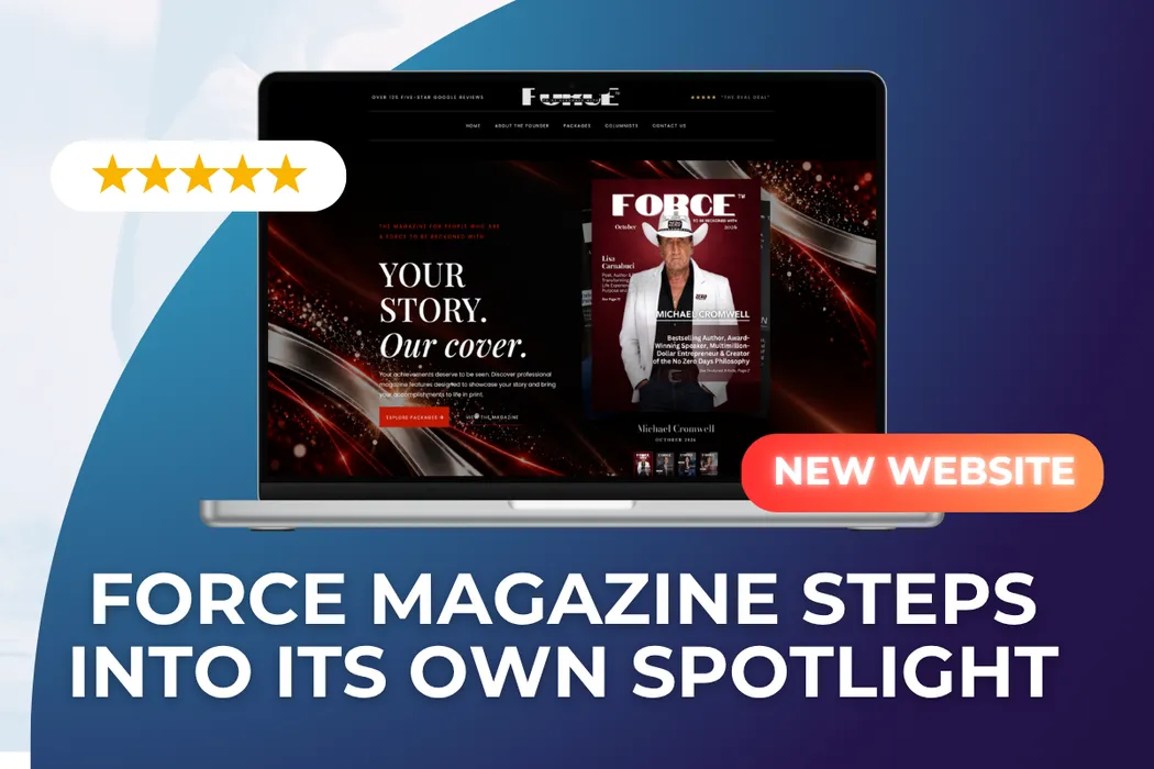
FORCE Magazine Steps Into Its Own Spotlight

FORCE Magazine is a print and digital publication founded by Cindy Witteman, an award-winning author, entrepreneur and nonprofit leader. It’s published under her parent company, CF Views. Each issue features entrepreneurs, business owners, authors and change-makers. It’s sold in 13 countries through Amazon, Barnes & Noble, Walmart and Target, and reaches an estimated 150,000 people a month across print, digital and social media.
What started as one part of CF Views has grown into a brand of its own, guided by Cindy’s philosophy: “People over Profit.”
The Challenge
FORCE had outgrown its brand, but its website hadn’t caught up.
As the magazine grew, its online presence became a patchwork. The site mixed the look of CF Views with FORCE’s own covers and graphics, and nothing tied them together into one clear identity. Visitors couldn’t easily tell where the parent company ended and the magazine began.
On the page itself, the inconsistency was everywhere:
Mixed visual styles. A dark banner, a bold red-and-black stats graphic, plain serif paragraphs, script headings and cover slideshows each followed their own design rules. The page felt pieced together rather than designed.
Fonts that didn’t match. Several typefaces in different sizes and weights competed on the same page, and much of the body text was too small to read comfortably.
Uneven layout and spacing. Some sections were full-width, others were narrow columns. Large empty gaps sat between blocks, which made the page feel unfinished and very long.
An archive instead of a homepage. Most of the page was a list of back issues, each with its own slideshow and small “Order Now” button. The magazine’s story and its offer got lost.
No clear path to getting featured. Features are how FORCE grows, but packages weren’t shown, and the main call to action was a small link buried in text.
A premium magazine with a basic website. The print magazine is glossy and editorial. The website didn’t feel like the same brand.
Cindy needed FORCE to stand on its own: a consistent, recognizable brand that still honored its CF Views roots, and a website that looked as polished as the covers.
The Solution: A Brand-First Website Redesign
We started with the brand, not the page. Before designing any sections, we defined how FORCE should look and sound on its own.
Giving FORCE its own identity
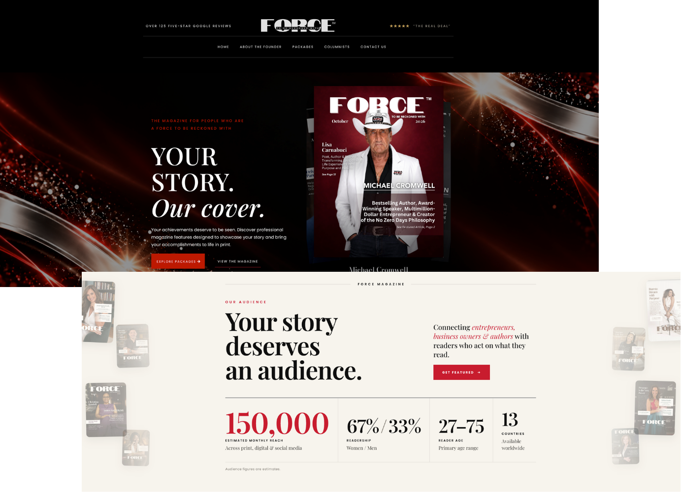
We created a consistent visual system for the magazine: a unified color palette, a clear set of fonts and editorial styling that echoes the print issues. FORCE now has a recognizable look of its own. CF Views stays in the footer as the publisher, so the relationship is clear without the brands blurring together.
One consistent design language
Every section now follows the same rules: matching heading styles, readable body text, consistent spacing, and buttons that look and act the same throughout. The page reads as one designed experience instead of a collection of separate pieces.
A hero worthy of a cover
The homepage opens with “A FORCE to Be Reckoned With” and “Your Story. Our Cover.” A banner highlighting 125+ five-star Google reviews builds trust before the visitor scrolls.
Proof, organized
The stats graphic became a clean stats section: 150,000 monthly reach, 125+ five-star reviews, 13 countries, and an award-winning founder. Retailer logos for Amazon, Barnes & Noble, Walmart and Target sit right beside it.
From archive to showcase
The long list of back issues became a focused recent covers showcase. A built-in digital edition viewer lets visitors flip through recent issues without endless scrolling.
A clear path to the cover
The site now explains why someone should get featured, lays out the packages (front cover, back cover and interior features), and walks visitors through a simple four-step How It Works process. Each package has its own inquiry button.
The founder at the heart of the brand
Cindy’s profile brings together her awards, her nonprofit Driving Single Parents and her Little Give TV Show. It connects FORCE to the mission behind it and to her larger CF Views story.
Built to convert
An audience section, Google reviews, an FAQ and a final “See Yourself on the Cover” inquiry form mean every interested visitor has a clear next step.
Before and After
Before | After |
|---|---|
Mixed fonts, colors and styles | One consistent brand system |
FORCE blurred with CF Views | FORCE stands on its own, with CF Views as publisher |
Long archive of back issues | Focused recent-covers showcase and digital edition |
Stats buried in one graphic | Clear stats, retailer logos and reviews up front |
No visible packages | Packages, How It Works and inquiry buttons |
Uneven spacing, small text | Clean, readable editorial layout |
The Outcome
FORCE Magazine now has a website that looks and feels like the magazine:
A distinct brand identity that lets FORCE grow alongside, not under, CF Views
Visual consistency on every section, from the hero to the footer
A premium, editorial experience that matches the print magazine
A clear path to getting featured, with packages and inquiry points throughout
A strong base for growth as FORCE reaches more readers in more countries
The Takeaway
When a project becomes a brand, it needs a home of its own. FORCE Magazine had grown into something bigger than where it started, but a patchwork website was holding it back. With a consistent, brand-first redesign, FORCE now shows up online the same way it does in print: polished, confident and a force to be reckoned with.
Is your brand ready for its own spotlight? Book a demo with Brand Builder AI.